I hope you are well and safe!  It has been a while since my last Newsletter but I expect we have all learned a few things living in these pandemic times, especially how we function (or not) in our homes.  I for one have been looking at my kitchen cabinets and noticing that they need re-finishing after 10 years of constant use. On the other hand, my garden continues to nurture and keep me sane. We often jokingly refer to it as “our cottage” with a 30 second commute - just walk outside and you are there. Bar none, our indoor/outdoor living space is the best investment we made in our home.

In terms of work space, much like the rest of the universe, I have been thinking long and hard about the concept of the traditional office. Zoom meetings have been an eye opener for me, especially the feature of screen sharing, which has allowed me to present drawings and concepts to clients remotely.  This is a “keeper” going forward because it is so efficient, decreases site visits and helps keep projects moving forward.  Plus, local and overseas clients love being able to work together online, even if we have never met in person!

Clients have also been in touch with enquiries regarding aging at home, as an alternate to nursing homes. As well, the idea of multi family living, especially as “boomers” age has come to the forefront. I am currently working with a special needs client to install an elevator in their large family home, as well as a main floor accessible washroom. For a younger client, who have just bought their “forever house”, we are incorporating these items now so that their home can easily be modified later.

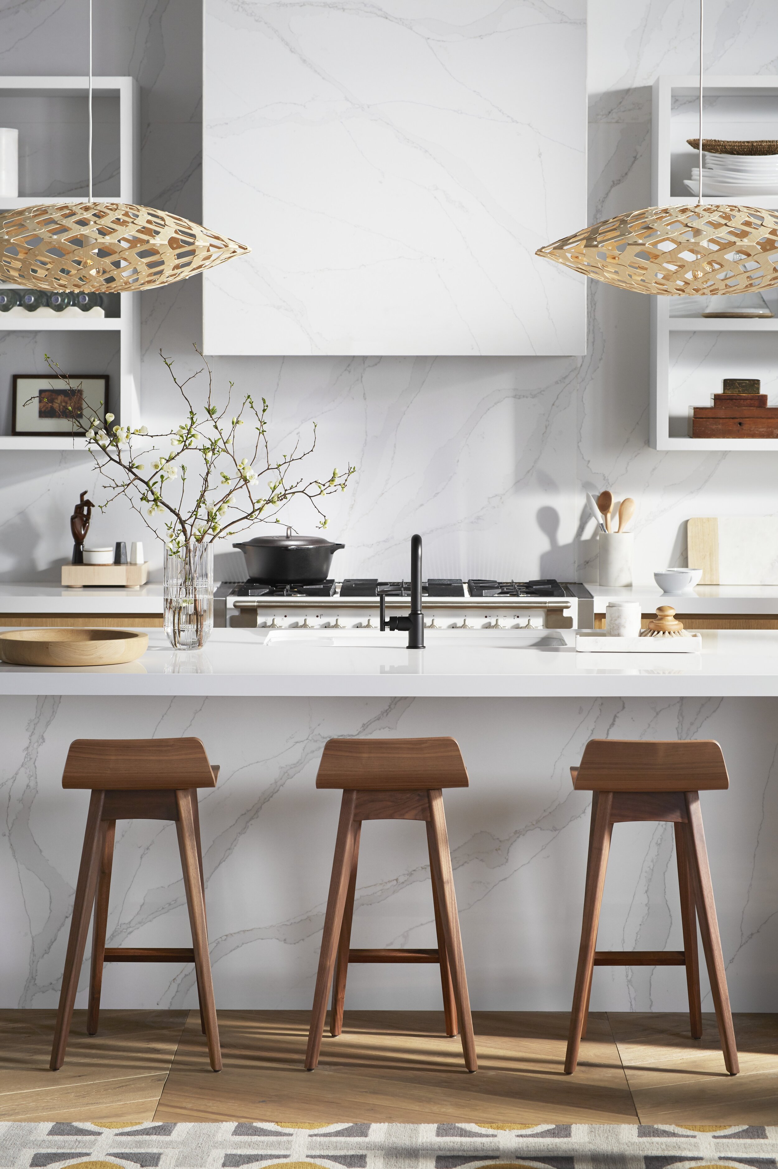
Multi-Family Living! Image from Blum Hardware https://www.blum.com/ca/en/

Multi-Family Living! Image from Blum Hardware https://www.blum.com/ca/en/

A question that clients have asked me is how to create a home that sustains them: makes them feel safe, nurtured, peaceful and calm. I think the reality that we are not as much in control of the universe as we may have thought has shifted our gaze to home which can hopefully be a place where you can exert some level of control and order.

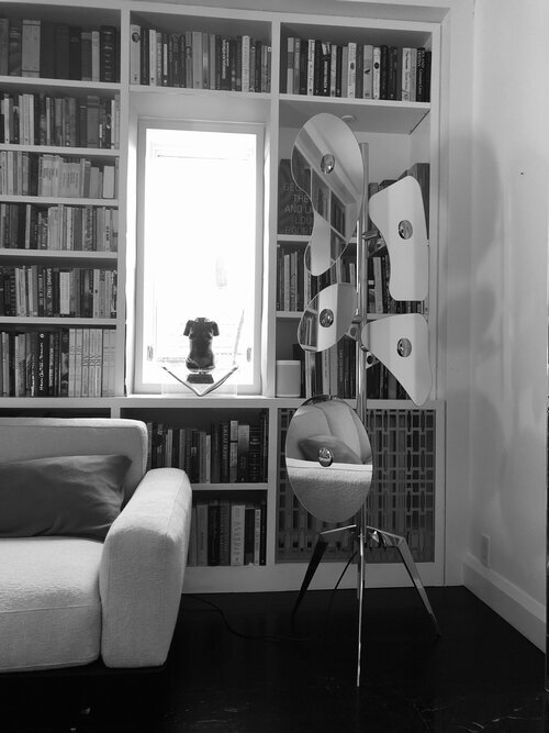
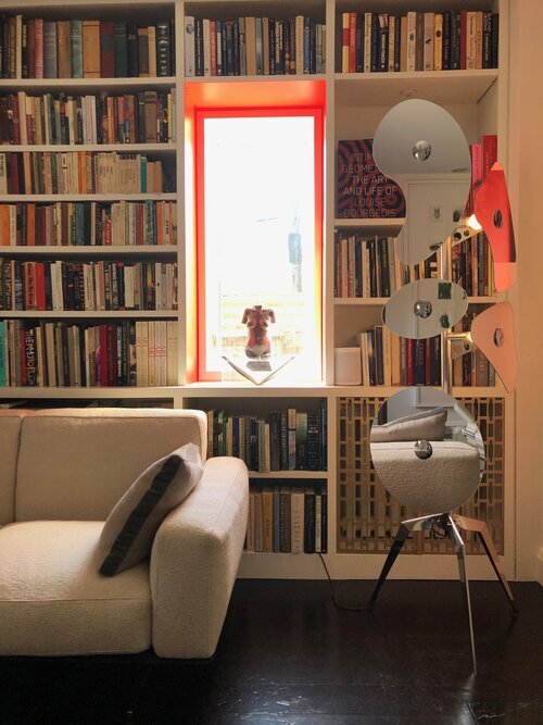
One simple thing I did in April, with little cost except for a little elbow grease, was to paint the inside of my deep window frames in my living room.  See before and after – I liked the calmness before but now, I like the warmth and energy of the red.  A simple change with big impact that made me feel good throughout the spring.

Finally, I wrote this before, but again I will say:  in this time of isolation, nothing feels better than just reaching out and talking to each other. Stay well and please give me a call or an email if you have any questions or have anything to share, or just want to say hello. Would love to hear from you!

Theresa

PS In the last month I have been asked to participate in several online panels discussing the impact of COVID on architecture and design. Here are the videos for each talk:

NKBA: How Will Home Design Change? 

Will design and architecture be changed forever? This week's Brave New Business forum welcomed expert guests to discuss the ways the kitchen and bath industr...

Cosentino: Future Thinking. What's Next in Design?

Posted
AuthorTheresa Casey

May 14th 2020

Photo by Donna Griffith 

Photo by Donna Griffith

Greetings from Theresa,

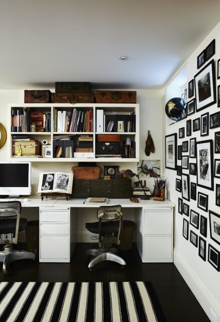
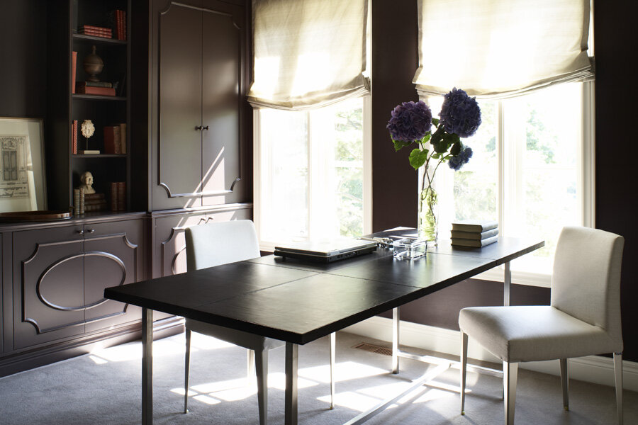
I hope you and your family are safe and healthy, and finding some moments to treasure during these trying times. Like everyone, I have been looking at my home from a new perspective and I feel grateful that my refuge nurtures me while I navigate these “new normals”. Many people  are working from home, like my client in her home office (see above), which was completed a few years ago. She tells me that she loves this clean, minimal and efficient space that helps her to focus on her work as a researcher. Plus, she recently brought her spin bike  into the other half of the room since her gym is temporarily closed, a shift she never expected. Others have let me know that they are working at their kitchen islands, while other “home offices” are simply the living room sofa with a laptop. Wherever you find yourself, try to make your work space as useful and nurturing as possible.   

With everyone’s focus on staying home, many of us are decluttering and rethinking areas of the home that aren’t working properly. On that note, I wanted to let you know there is help available! I am offering an easy online consultation service via Zoom. It’s an opportunity to take advantage of this sequestered time to make a positive change to your surroundings, whether you have been thinking about cleaning out areas and need some design direction, or if you need some help in freshening up tired areas of your home. 

Also, “Room by Design”, my online design service launched last year, is perfect for the DIY enthusiast who needs a road map, suggested materials to use, and a shopping list. It is live on my website and can be accessed at https://www.roombydesign.com/.

Finally, in this time of isolation, nothing feels better than just reaching out and talking to each other. Stay well and please give me a call or an email if you have any questions or have anything to share, or just want to say hello. Would love to hear from you!

Theresa Casey

PS. Stay tuned for my next update on helpful garden ideas and how best to navigate the permit approval process during the pandemic.

Posted
AuthorTheresa Casey

February 11th 2019

My urban garden was featured in the House & Home magazine a few years ago as well as in as a video from House & Home online TV.  With Spring just around the corner( I hope!), now is a good time to look back at be inspired by my blog “Creative Retreat” describing the story behind my European inspired courtyard. Scroll down to see the full blog.

Theresa Casey in the lower courtyard of her eclectic garden.

Theresa Casey in the lower courtyard of her eclectic garden.

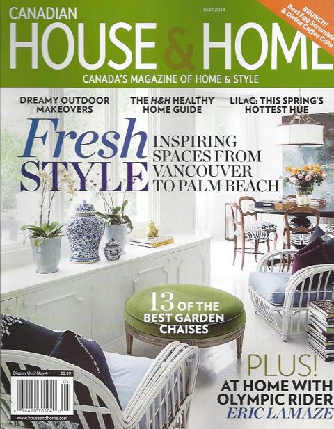
The May 2014 issue of House & Home features an inspired courtyard garden designed by Theresa and her husband, Robert. Not only is it beautiful, it serves a variety of functions -  eating and entertaining, relaxing, gardening and creating art in the studio. To achieve this, four zones were planned: an upper terrace, a lower courtyard, a cozy sitting area and an artist's studio in the underused garage. 

A rich layering of textures, such as stone, brick, wood, iron and lush planting beds create a visual and sensory oasis in the city, reminiscent of European courtyards nestled in small, hidden urban spaces.

If you are interested in more details about the story behind this urban retreat, check out the May 2014 issue of House & Home. Below you will find a few shots showing the construction of the garden and scenes from the magazine photo shoot.

The garden, stripped down to its bare elements - including the single slab stone bench at the back - before weathered stone was laid for the floor and steps up to the terrace.

The garden, stripped down to its bare elements - including the single slab stone bench at the back - before weathered stone was laid for the floor and steps up to the terrace.

Casey Design/Planning Group is featured in the May 2014 House & Home "Inspired Home" issue.

Casey Design/Planning Group is featured in the May 2014 House & Home "Inspired Home" issue.

The garden in full growth after the reconstruction - seen from the back - with the salvaged fountain centered in the lower courtyard.

The garden in full growth after the reconstruction - seen from the back - with the salvaged fountain centered in the lower courtyard.

Egyptian Deco doors lead into Theresa's studio from the stone courtyard.

Egyptian Deco doors lead into Theresa's studio from the stone courtyard.

Once a garage used for storage, the studio features exposed brick, salvaged antique French clay tiles and wood beams that create a sense of age and character.

Once a garage used for storage, the studio features exposed brick, salvaged antique French clay tiles and wood beams that create a sense of age and character.

The walls and tables are adorned with found objects and inspirational images from Theresa's eclectic collections.

The walls and tables are adorned with found objects and inspirational images from Theresa's eclectic collections.

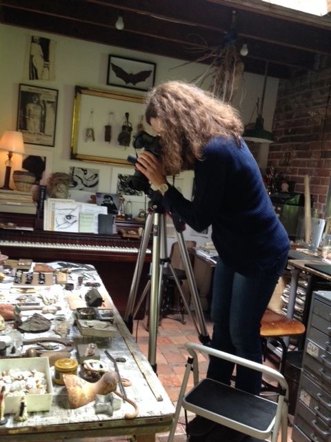
At the photo shoot, photographer Donna Griffith checks her lighting and image cropping before taking her superb photographs.

At the photo shoot, photographer Donna Griffith checks her lighting and image cropping before taking her superb photographs.

Behind the scenes in Theresa’s studio, Donna works to get the perfect angle

Behind the scenes in Theresa’s studio, Donna works to get the perfect angle

The end result - a lush, romantic and inspirational courtyard that welcomes many different uses and acts as a "growing canvas" for the designer's ideas and creative experiments.

The end result - a lush, romantic and inspirational courtyard that welcomes many different uses and acts as a "growing canvas" for the designer's ideas and creative experiments.

Posted
AuthorTheresa Casey

September 18, 2018

We are very pleased to announce that on September 18th, 2018, Casey Design|Planning Group was awarded the 2018 inaugural Value of Design Award of Excellence (VODA) for Residential Design by the Registered Interior Designers Association of Canada (IDC) for the “Pear Tree Farm” project in Milton, Ontario. The project is also the recipient of a 2018 ARIDO Award. Please scroll down below for photos and project description.

Photograph by Nick Wons.

Photograph by Nick Wons.


The Traditional Farmhouse Reimagined

April 2nd 2018 (Previously Published Blog)

Our design for my client’s beloved 1850’s stone farm house in Milton was featured in the National Post Newspaper. Attached is the link to the article from March 31, 2018 (bit.ly/1850sStoneFarmhouse) and as well I thought I would share some before and after photos and an insider view of the concept and process.

MiltonFarmHouse_LivingRoom_Horizontal_F1.jpg

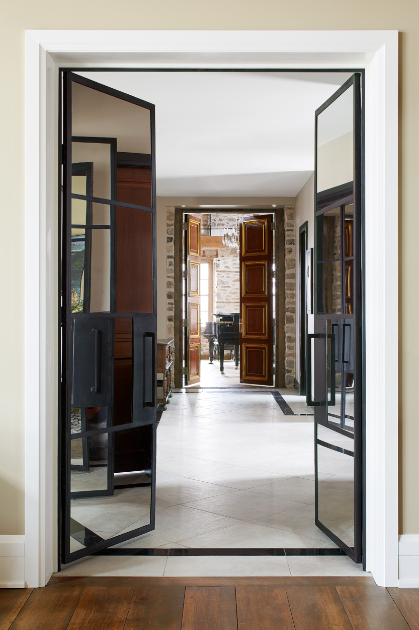
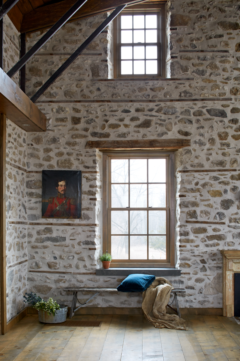
This project is about the resurrection of an 1862 Regency Georgian stone farmhouse, a designated Heritage Building, and its adjoining structures destroyed by a massive fire in 2013.

The ruins of the property sat exposed to the elements for close to two years and became saturated with moisture and wood rot, requiring a complete rebuild and restoration. The farmhouse had been in the family for many generations and now it was a gothic ruin, like Thornfield Hall in Jane Eyre. But, there was something about the place, a spirit of sorts that made the project much more than just a renovation.

The client, a classical pianist, wanted to retain as much of the original character of the farmhouse as possible, while needing formal living, dining and kitchen spaces, as well as a family room, a private master bedroom suite, multiple bedrooms with ensuites for children and guests, a library/office, a potting shed, a games and AV room and lastly, a large concert space for public gatherings to showcase her two grand pianos.

The challenge was to achieve a high-end result within a mid-range budget, given the limited payout from the insurance company.

Additionally, we needed to adhere to Heritage Department requirements, address long-term sustainability issues, provide maintenance solutions and consider the future saleability of the renovated property. Client specific requirements were to address acoustical conditions for concerts and heat control for instruments.

MiltonFarmHouse_Exterior_003_F1.jpg

Our concept created a contemporary reinterpretation of vernacular historic farm homestead.

By introducing modern forms and materials to complement/contrast with existing heritage elements, we juxtaposed the old with the new, giving each their cultural and architectural precedence. The property originally featured 2 stand-alone stone buildings; the original 2 storey stone homestead (stone building above far right) housed living space on the main floor and bedrooms on the second floor and a smaller stone outbuilding, possibly the original stables (stone building above far left). Our concept (and finished result above showing connecting space stone buildings) was a new take on a traditional farmstead: to join the two existing stone buildings with a contemporary central section thus creating the experience of a rambling collection of farm buildings. The Historic stone juxtaposed the metal standing seam roofs of the 'allegorical' barn structure and further contrasted with contemporary Ipe wood slatted facade of the contemporary middle structure, reminiscent of aged barnboard walls.

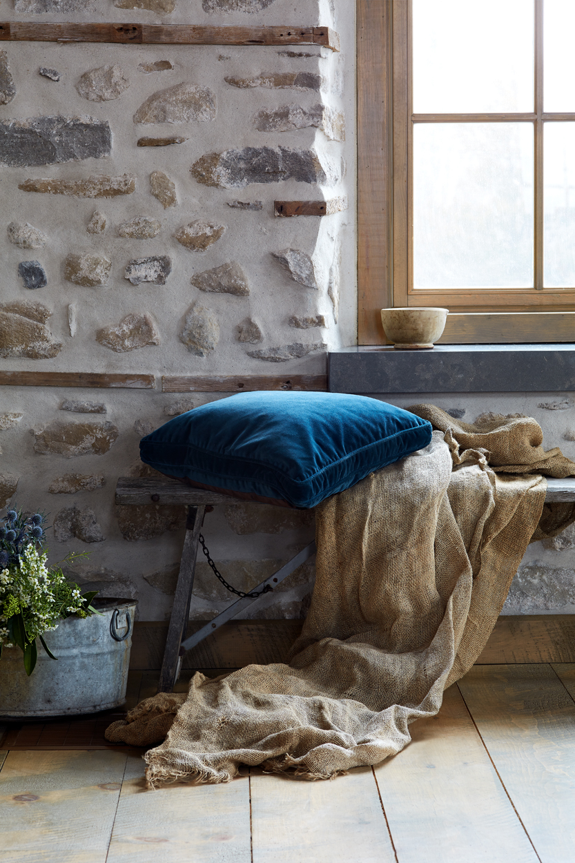
Before the construction began, a local contractor who specialized in stone house restoration, worked to strengthen and repair the shell; once the heavily damaged plaster and lath was removed, the beauty of the old walls was fully revealed and we opted to keep them exposed. This provided a visual history of the farmhouse structure with “ghost” traces of original details. Lastly, the exposed stone walls provide acoustic value, textural and visual warmth. A new heating system introduced high velocity currents of air from the energy efficient geothermal system (sustainable).

A music concert space was located in the previously two storey farmhouse and the newly open, dramatic space also doubled as a formal salon/living room. The contemporary addition housed a large open concept kitchen, family room, library, games rooms and numerous bedrooms, while the stables became the master suite.

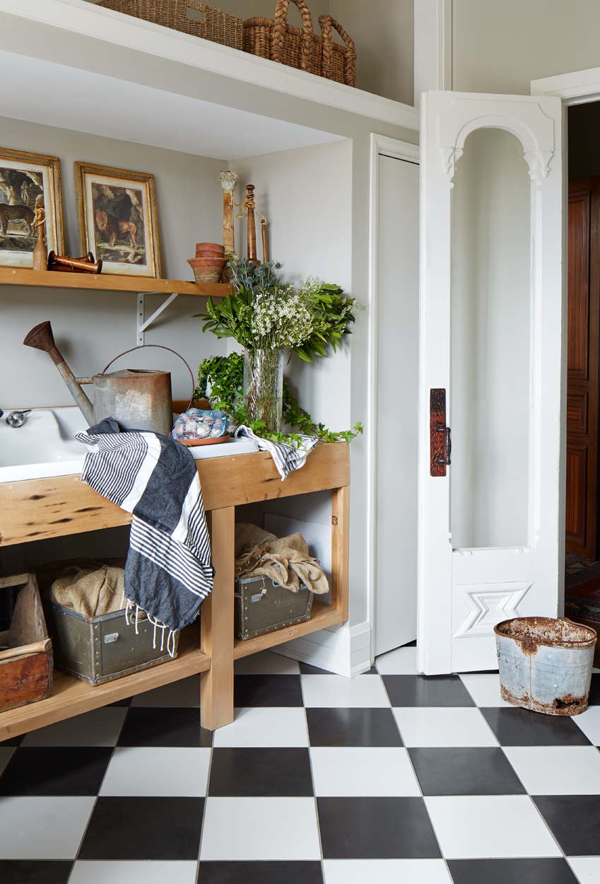
As a passionate gardener, one of my client’s favourite rooms is the potting room. With traditional black-and-white checked floors and a big side counter for dividing perennials and potting up geraniums. The doors to the potting room are a pair of lacy old Victorian French doors that my client found at a local flea market.

MiltonFarmHouse_Kitchen_Overall_F1.jpg

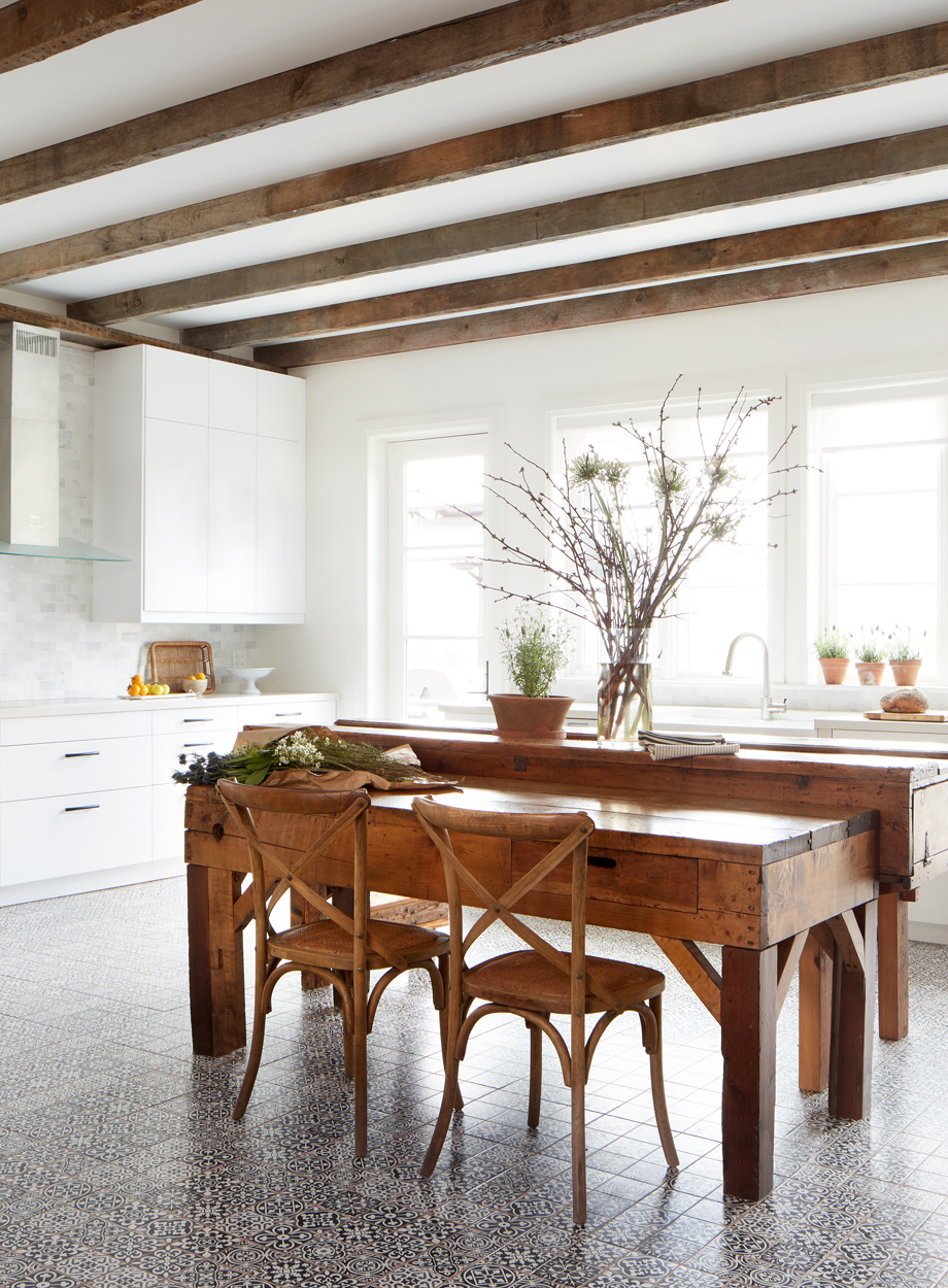
Though it is modern and clean, the kitchen has its own sense of the past, with reclaimed timber ceiling beams, and in place of a central island I incorporated worktables found in an out building. The use of antique, one-of-a-kind furniture, mixed with contemporary elements is one of my favourite combinations because the warmth of the old plays off the clean lines of the new.

Handy drop spot and bar area flank large storage pantry and double door fridge.

Handy drop spot and bar area flank large storage pantry and double door fridge.

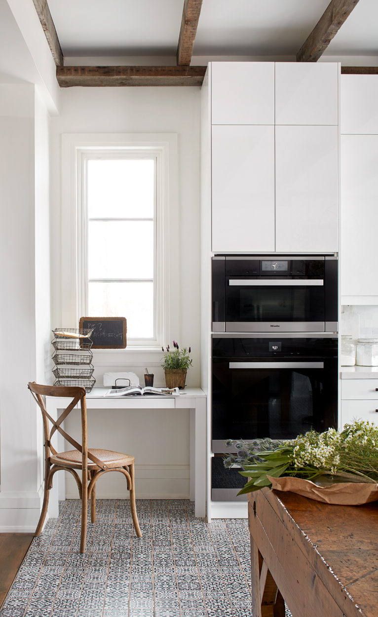
Vintage inspired floor tiles add to the modern chic farmhouse vibe.

Vintage inspired floor tiles add to the modern chic farmhouse vibe.

The kitchen office (above right) is a different kind of sanctuary as it overlooks a huge vegetable garden - a nice spot to ponder recipes for soup making or canning.

MiltonFarmHouse_LivingRoom_Vertical_F1.jpg

I love that this old 1850s farmhouse was literally brought back from the ashes and restored after the devastating fire. We brought it up to now, to make it work for this family. It takes advantage of modern materials and methods, but speaks to the past, the family’s as well as to Canadian history. (Photographs by Donna Griffith.)

Below are images of the work in progress of the Farmhouse.

The burnt out shell of the farmhouse.

The burnt out shell of the farmhouse.

The original Italianate entry door and historically original frame with side lights and transom which we restored and reinstalled shown above post fire. Note the stairs that were removed to create the open concert/salon space.

The original Italianate entry door and historically original frame with side lights and transom which we restored and reinstalled shown above post fire. Note the stairs that were removed to create the open concert/salon space.

Construction of the new linking contemporary addition.

Construction of the new linking contemporary addition.

In process: the restored stone walls on the right and the damaged walls still on the left to be worked on. Also, see the cut off 2nd floor joist, new metal struts and new vaulted ceiling clad in warm stained wood. The joists were re-used throughout …

In process: the restored stone walls on the right and the damaged walls still on the left to be worked on. Also, see the cut off 2nd floor joist, new metal struts and new vaulted ceiling clad in warm stained wood. The joists were re-used throughout the project including in the kitchen ceiling. In the final solution here we installed hidden perimeter lighting inside of reclaimed wood valances.

Almost there - furniture is being delivered...

Almost there - furniture is being delivered...

Posted
AuthorTheresa Casey

September 4th, 2018

Leslieville, an east-end neighbourhood in Toronto is considered to be one of the city’s most popular places to dine, drink, shop and live. However, 20 years ago you would not recognize the area because it was heavily industrial with a concentration of factories and warehouse buildings often housing my friends from art and design school. Today, with the changing to the residiential building zones those warehouse buildings have been renovated into beautiful loft apartments and shape the character of the main streets; Carlaw Ave., and Gerrard Street.  The old architecture  remains deeply connected with Leslieville's history and identity. 

x1. 695-original-1.jpg

Like all historically significant buildings in Toronto, properties are protected against demolition or significant alteration of the facades as described in the Heritage Act. In this blog, we give a few tips on how to navigate renovation in historically significant buildings like those you find in Leslieville. This blog is a snap shot of our process in relation to historic buildings.

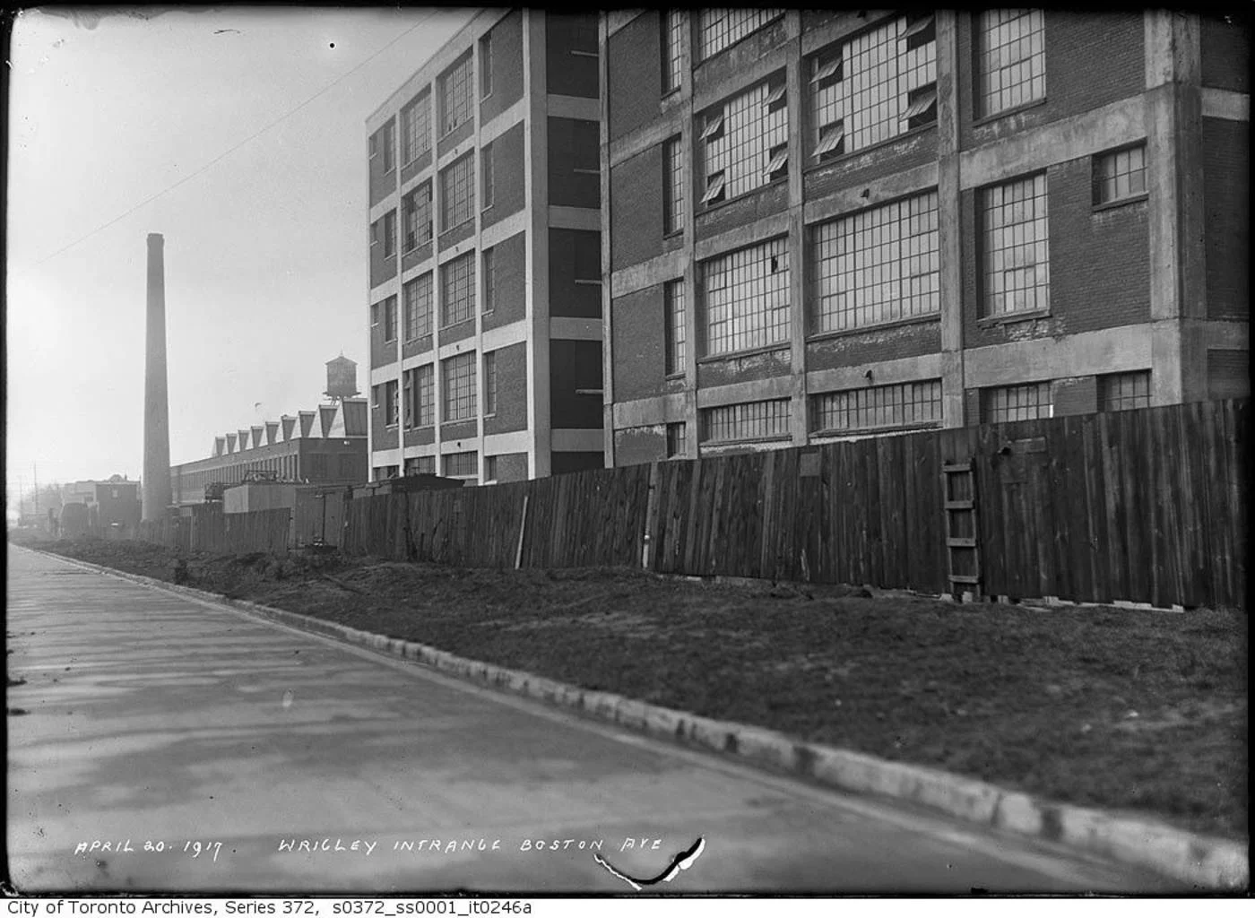
Wrigley Co. Factory, 1917.

Wrigley Co. Factory, 1917.

1. Healthy client relationship.

A collaborative, team approach ensures that both our vision and the client’s vision come to life. Each project is spearheaded by  Theresa Casey. We work to establish communication lines to work directly with our client's  needs, including how these tie in with the requirements of historically significant buildings in Toronto.

2. Working together on one vision.

We work with clients on all phases of the project, including: budgeting, design, space planning, detail development, material selection,project management, furnishings and accessories and final implementation.

3. Don’t be afraid to play. 

There is a lot of opportunity to do playful things, while also keeping the integrity of historical spaces. This means being able to combine contemporary design that compliments historical architecture.

4. Preserve the street-view façade.

We work closely with the architect to ensure the street-view façade is maintained as they are protected by Code. Maintaining the character is paramount to maintaining the neighbourhood’s identity.

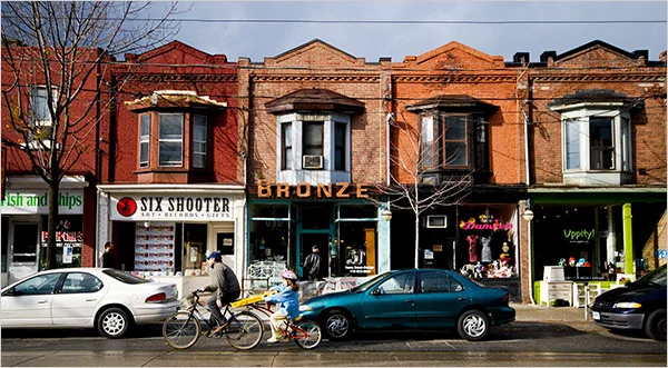
Leslieville today has the Arts and Crafts Bungalow style housing as well as the Toronto Bay-and-Gable styles of the 1880s. 

Leslieville today has the Arts and Crafts Bungalow style housing as well as the Toronto Bay-and-Gable styles of the 1880s. 

5. Budget the time needed to replicate era-appropriate details. 

Custom-made details take time, especially those that need to adhere to era-appropriate styles. Casey Design is experienced in creating details that both compliment and replicate the era in which historical properties are built.

6. Old architecture needs love. 

With historical buildings you never know what kind of problems from the past you could encounter – such as moisture problems, structural problems - anything is possible with old buildings. The first element of a historical renovation is giving the place a lot of love! We work with the architect to make sure existing buildings are restored (where needed) and fit for renovation.

Below are some historical photographs of the architecture in Leslieville, Toronto.

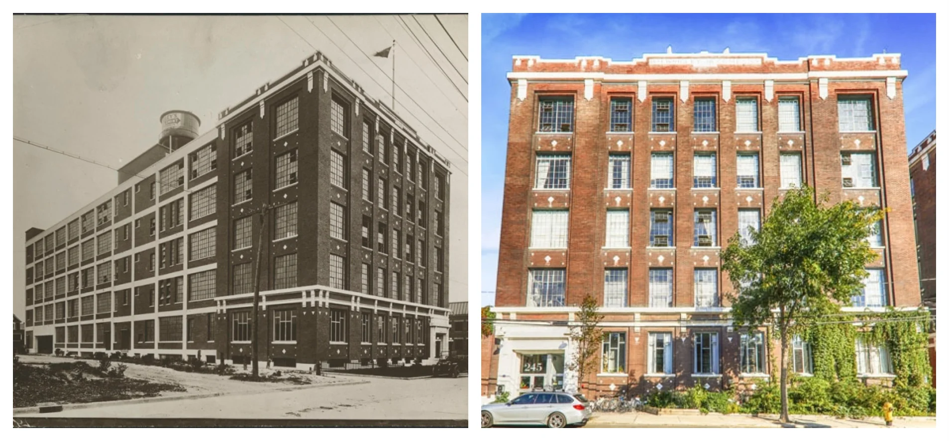
The Wrigley Building (245 Carlaw Avenue) was completed in 1916. The Wrigley Building Today (right.) 

The Wrigley Building (245 Carlaw Avenue) was completed in 1916. The Wrigley Building Today (right.) 

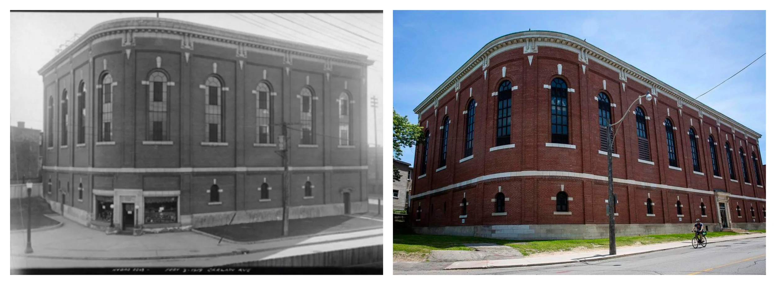
Carlaw Hydro Building 1919 (left) and today (right.)

Carlaw Hydro Building 1919 (left) and today (right.)


More historical imagery of Leslieville.

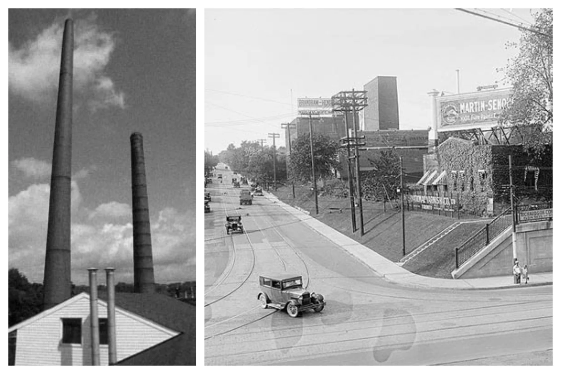
Old industrial chimney stacks (left) and view of Carlaw and Gerrard looking north, in the 1900's (right).

Old industrial chimney stacks (left) and view of Carlaw and Gerrard looking north, in the 1900's (right).

Posted
AuthorTheresa Casey