It is one of the pleasures of my work to create custom furnishings for my clients.  There are a variety of reasons why we take this route such as a special size requirements or material combinations, lack of availability on the retail front or the desire to have a unique piece designed especially for you.  This is the world of "Bespoke" design.  To understand how I go from an idea to the finished product, I thought I would take you through the process of how I designed the brass & terrazo coffee table below.  


My work always starts with my clients,  their point of view and how I interpret their needs to fit their home.  These clients are two busy professionals with three young active toddlers.  The brief was to design something that was first and foremost safe (which meant absolutely no glass, no sharp concerns), basically indestructible, beautiful, and sophisticated.  I had already designed the curved custom sofa in the room with beautiful nubbly wool fabric so I looked at materials that would complement the solid fabric and found this beautiful patterned slab stone which I combined with brass.  I then went on to develop the form  and how to make it structurally sound.

The finished product installed in the living room.  See below for initial sketches, photos from the manufacturers studio and getting it into the space.

Preliminary sketch for the coffee table.

One part of the design process of this table was the structural engineering component which ensured that this table was completely solid.

By creating an inner sleeve in brass we were able to add structural stability while keeping the design integrity.  The underside of the table would not be seen unless little ones were crawling underneath which they could safely do with this amount of structure.

Four Delivery men were required to get the table in - coordination details that come up in my world all the time.

Arrived!

The new table in the living room with a view to the dining room beyond.

Posted
AuthorTheresa Casey

Carlos María Domínguez


I have had the good fortune of designing many personal libraries for myself and for my clients. It must be a common bond as from an early age I was a voracious reader and to this day always have a pile of books on my bedside.  Often, when I meet with clients, one of the first things that comes up is their books and how they want to see them in their home. It is a commonly said  that a person's books tell a lot about them and I think that that is true, just as a person's home should be a reflection of them. Below are some of my favourite libraries that I have designed over the years and as well a bit about the New York Public Library.  This  was the location for an event I attended a month ago with Benjamin Moore Paint to unveil their 2017 Color of the Year, "Shadow".   

A lovely project which housed this client's collection of 10,000.00 books in an historic home in Toronto's Rosedale.

 A young fresh approach to library for a couple starting out with a new baby.

A cozy corner in this library that is specifically featuring this client's Antique Toy Soldier Collection and history books.

Exquisite saturated colour in this library in a Toronto Edwardian home. 

Below, a some of the history of the New York Public Library:  Carrère and Hastings were the designers and constructors of the New York Public Library built the 1890s.   They studied at the École des Beaux-Arts in Paris and  infused French architectural concepts  and adapted them for New York. The result was the largest marble structure ever attempted in the United States.  More recently, the library has undergone a $300,000,000. renovation and update by the Dutch Architecture firm Mecanoo.

Original Section Drawing of The New York Public Library.

Exterior of The New York Public Library.

Details of the ceiling.

A truly inspiring space to work in!

Posted
AuthorTheresa Casey

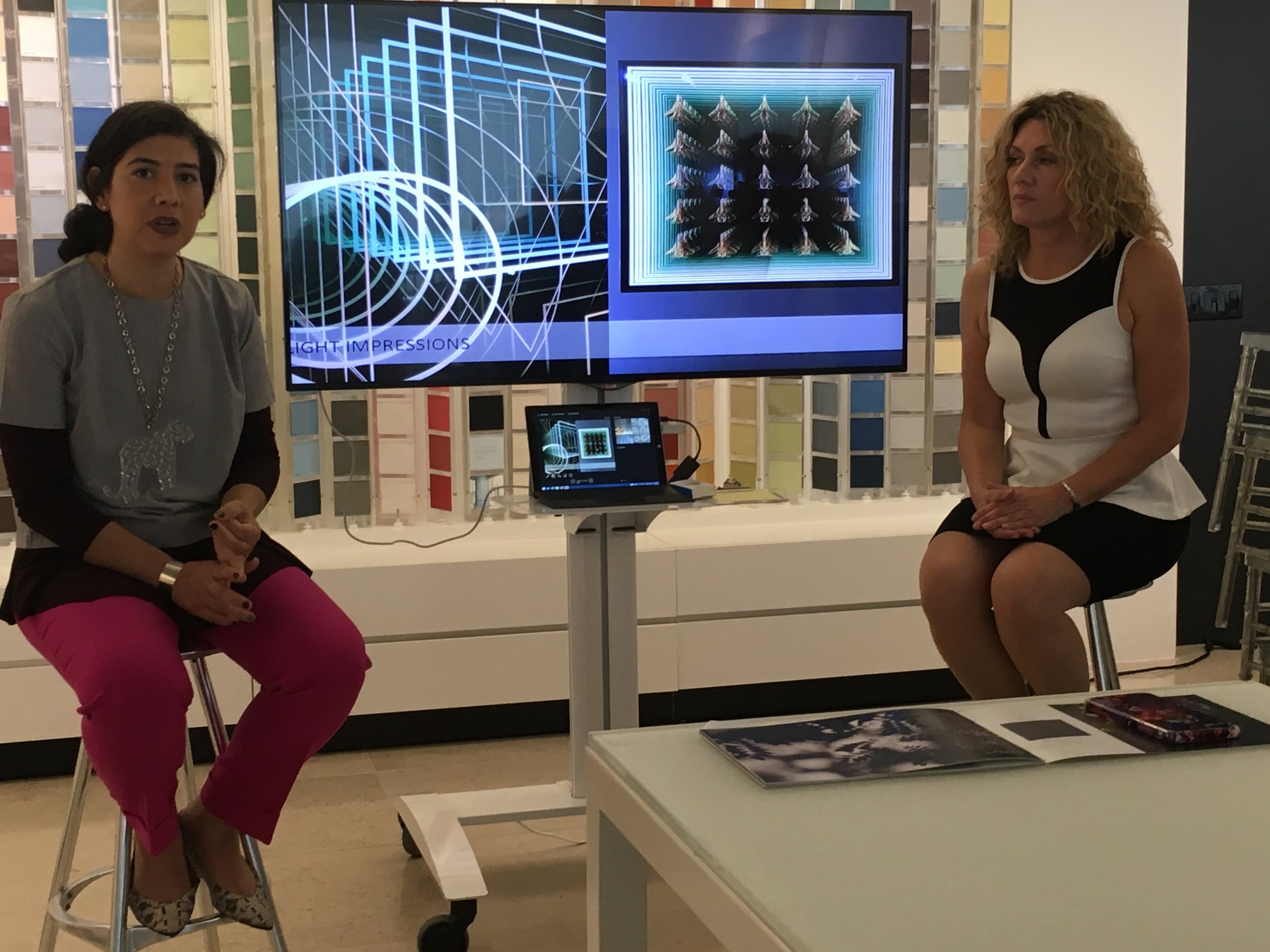
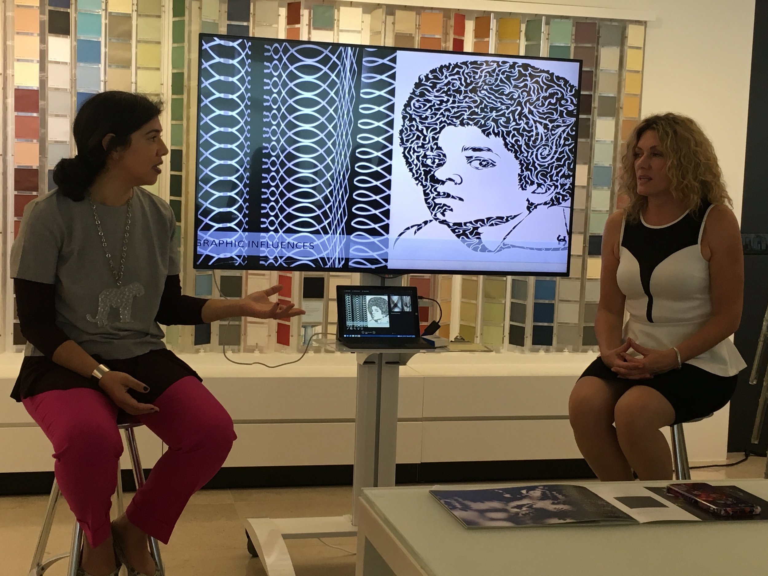
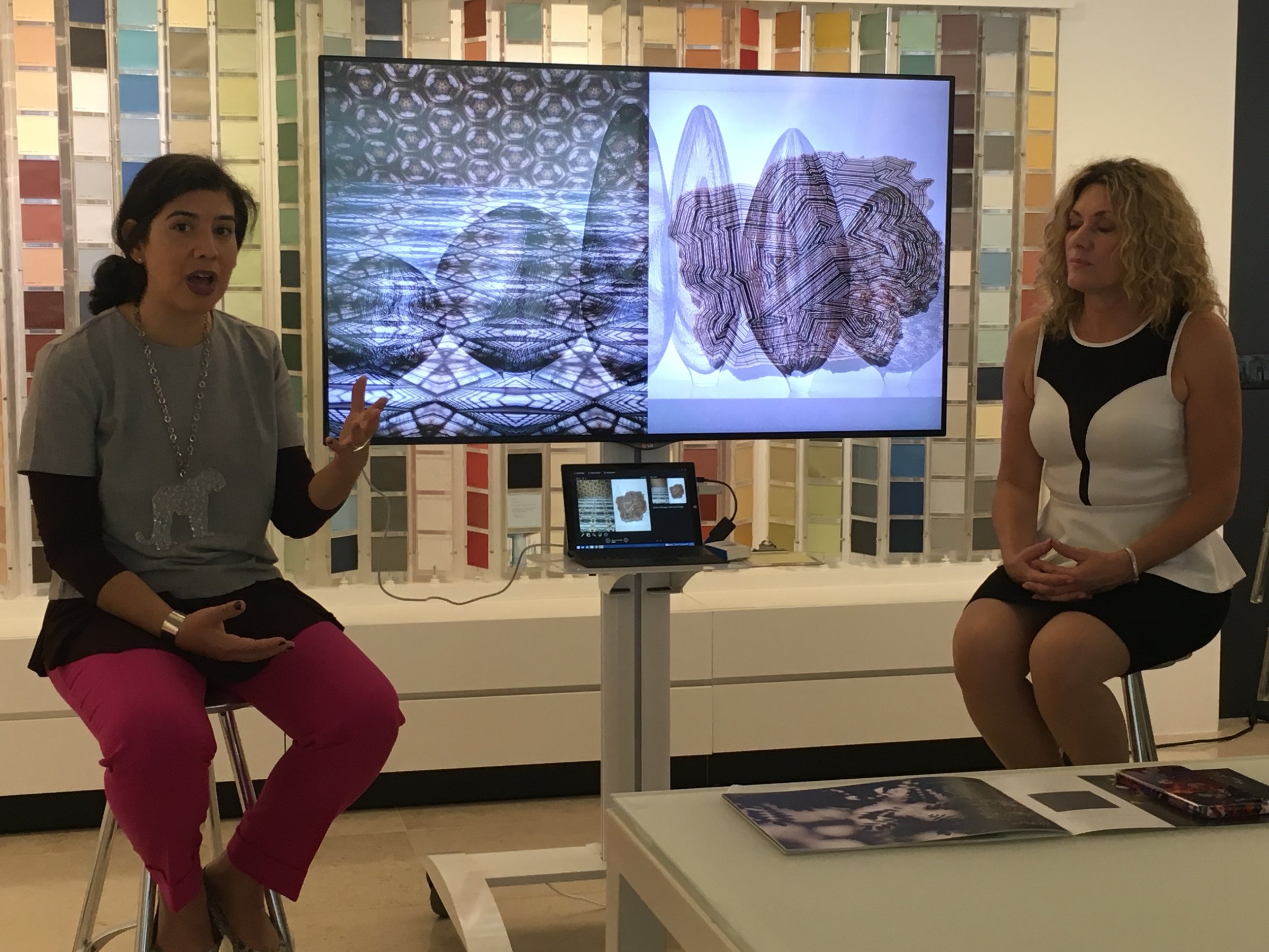
I was recently in New York to attend Benjamin Moore's unveiling of their color for 2017. Not only was I intrigued to find out what their color choice was I was also very excited at the venue for the evening event. It was held at the New York Public Library which has been in renovation for the past four or five years.  So for me, a win-win on both accounts.  The evening did not disappoint and before I even entered the great Library Hall  I spent a good 15 minutes wandering around looking at the beautiful Beaux Arts building. (more on the background of this building in next Friday's blog).  Onto the event and a wonderful prelude to the launch was an inspiring slideshow of what inspired this choice of the color of the year which is a smoky eggplant purple called "Shadow" No. 2117-30.  I met with one of the many researchers and designers who spent the year traveling the world looking for inspiration and digging into "the collective unconscious" to see where the Zeitgeist was and what color would be a good reflection of this. Their thinking on this color was that the world was looking for a deeper color to surround themselves with, perhaps time to reflect.  Given the recent election and year of unexpected political shifting, I for one wouldn't mind cocooning  in a room that was painted this color.  In fact, check out my client's home office done in this color.

The New York Public Library Entrance

Designers from Benjamin Moore talk about some of the imagery that helped them to arrive at the colour of the year.

My client's home office in the colour of the year - a deep rich environment for creativity at the workplace.

A nook from my bedroom in "Shadow".

Posted
AuthorTheresa Casey

I am very honoured to be selected as an "A List" Interior Designer by Canadian House & Home magazine.  I  have had a long association with the magazine and this recent honour has lead me down memory lane to look at some of the my many projects published over the years:  my early days as a gesso artist, all my homes and a huge variety of client projects.  See below:


My living room featuring a mirrored fireplace and vintage prototype chairs.

30 years.  What a milestone!

My kitchen was inspired by 1930's luxury ocean liners.  Everything in it's place and a place for everything.  It's the smallest kitchen I have owned but the most efficient.

Details, details and me in the background working at the dining table.

A lovely vintage inspired project from 2013.

Back to 2005 but this room still holds it's own.  This client has moved recently and we are bringing along all these timeless furnishings.

I love the architectural elements that I added into this client's master bedroom.  It makes the sitting room at the forefront cozy and contains the bed for a timeless and classic look.

Wow - my first house from almost 20 years ago . . . but I still love this and would move back in a heartbeat.  Note the muslim fabric which I was credited with putting into interiors when the truth was also that I was young and starting out and it fit my budget!

The foyer in my current house - nice to look back as this was published 5 years ago and since this I have put  real peacock feathers to the walls for a magical effect.

A lovely project for a young hip couple who were open to transforming their 1980's builder home into a custom contemporary pad.

This classic library is still one of my favourites.   A historic Edwardian home in the middle of Toronto,  my goal was to restore this room to what I imagined it looked like when it was built at the turn of the century.   I designed the hand carved oak mantle, the custom book cases and restored the damaged stained glass to showcase my client's huge library and many collectibles.  

Posted
AuthorTheresa Casey

Waterworks plumbing fixtures is truly one of my favourite manufactures for their high quality and terribly stylish take on everything bathroom and kitchen.  I am therefore thrilled to be included in owner Barbara Sallick's new book “The Perfect Bath”.  My project (included on Page 245 top right) is from my home - see photos below.  

My house was built in the 1930’s and my design concept was inspired by that rich era and in particular the home of Coco Chanel who lived at the Paris Ritz.   I imagined that this is what her ensuite would be like in her apartment.  My ensuite features a chic combination of materials: black marble and glass, hand finished cherry wood combined with warm smokey brown tortoise shell coloured paint to create drama and warmth.  On a personal note, my grandmother’s first cousin was legendary Harpers Bazaar fashion editor Carmel Snow.   I have included a picture of Carmel and Coco  at Chanel’s apartment in the Ritz along with timeless shots of Chanel's apartment.

Glamorous black glass vanity with deco inspired brass hardware.

The drapery fabric really makes this room  -  I have always loved the chic combination of brown and black stripes and drapes in a bathroom always add softness since all the other materials are necessarily hard surfaces.

 Harper's Bazaar fashion editor Carmel Snow (my grandmother and Carmel's mothers were sisters) and Coco Chanel at her apartment in the Ritz from Life Magazine.   To the right, a copy of the one many beautiful Bazaar magazine covers.

Screen Shot 2016-10-27 at 12.50.32 PM.png

Chanel's living room - so warm and layered.

Books and books . . .

Oh I do wish I could have sat down at this table to have dinner with Carmel and Coco.

Nothing more to say . . . stunning simple fireplace.

Another cozy, chic place to write a few thank you notes.

Posted
AuthorTheresa Casey