

Colour Theory
Quick facts
Size: 1500 sq. ft.
Scope: Living Room, Dining Room, Family Room, Master Bedroom
Timeline: Three months
This client needed interior design help with furniture layouts, paint, furnishings and accessories. They had bought their home two years prior and had done some furniture purchases but ran out of steam and inspiration. The couple had an appreciation for clean contemporary furniture, but needed guidance on an overall concept, implementation and completion. This was a builder home and they wanted to add personality to the bland standard finishes.
-
BEFORE
The Living/Dining Room was long and narrow and the sofa was placed on the long wall. This emphasized the bowling alley shape of the room and didn’t create an inviting seating area. The sofa and Noguchi coffee table were great pieces to start with, however, the dining table was from the client’s school days and they wanted to upgrade. The family room at the back of the house had a white leather sofa, which was too big and awkward for the room and was difficult to get around. There was no storage for their toddler's toys and the white walls were cold and clinical. The master bedroom had a terrific Hastings bed, but no other furnishings.
AFTER
The interior design challenge in this builder home was to create interest and texture in a home missing both. We added accent colour walls for impact and focus, and furniture that was clean, with a lot of personality and infused by the hand of the maker, as opposed to mass-produced. This approach meant that key pieces stood out against the existing white canvas background.
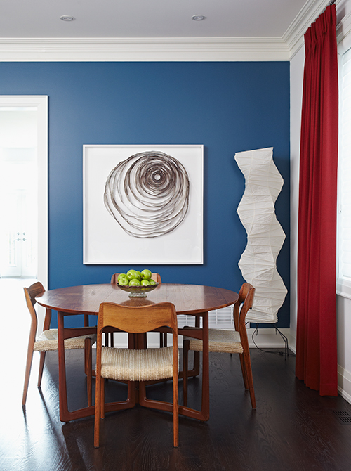
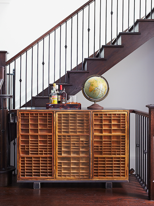
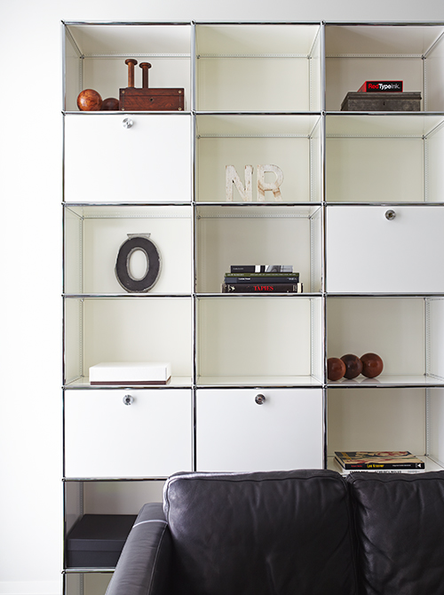
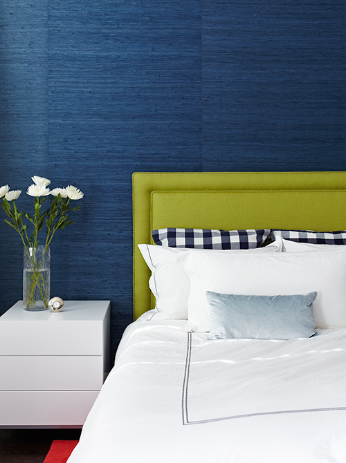
At the entrance, we installed raw linen “Circles” orange and red wallpaper and a clean Lucite console table. This dramatically introduced the house and immediately created a personality for the foyer. The living room furniture was re-planned to create a separation between the living and dining room, a quirky vintage display cabinet added focus, while red drapes and green carpet added warmth, visual framing and drama. In the dining room, we sourced a 1950’s teak table and chairs, boldly painted one wall turquoise blue, and added much needed storage and texture with the vintage “letter press” cabinet. In the family room, the existing white wall was papered with a kid-friendly vinyl wallcovering. We layered a collection of vintage letters in a variety of sizes and materials onto the wallpaper for an unexpected element that appeals to both children and adults. Opposite this wall, we installed a contemporary white gloss tall cabinet for storage. In the master bedroom, we added texture and drama with the navy blue accent wallcovering behind the bed, and a raw lime green linen upholstered headboard. The red rug boldly completed the goal of adding visual warmth and interest.
One of the key ways we made the spaces both interesting and infused with personality was in the careful balancing of materials. With a few key bold moves, we transformed this builder beige house into a fresh, energetic home for a young couple.
