WHITE BRIDAL SALON
The client, a well-known Toronto fashion journalist and stylist, had a vision to create a unique, luxury bridal salon in the city. After much deliberation as to the best location, the client settled on a dilapidated Victorian semi in the chic Yorkville neighbourhood. The house, once the headquarters of the unofficial "Mayor of Yorkville" Bud Sugarman, was in dire need of a fresh interior design vision.
Working with the client, we devised the design concept of a Parisian apartment boutique where customers would experience an attentive, personal bridal service set within three levels of Parisian luxury.
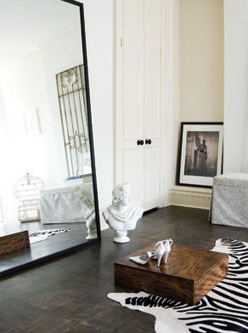
We located the main showroom on the first floor, where a large front room featured racks of dresses by top designers such as Oscar de la Renta and Monique Lhuillier, while a more intimate room at the back housed the bridal accessories.
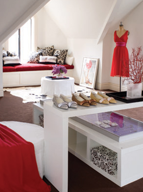
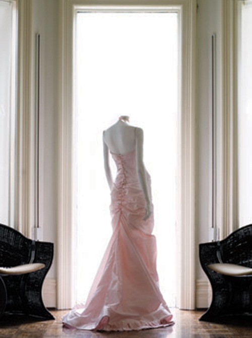
The second floor, originally bedrooms, housed three spacious and private dressing rooms for the bride-to-be, with ample room for the mother of the bride and girlfriends. We opened up the third floor to become a contemporary bridesmaid loft, where the bridal party could gather to try on a variety of designer dresses, shoes and accessories.
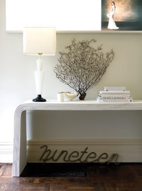
Exquisite wallpaper on feature walls highlighted the colour scheme of lavender, white and pink, and contrasted elegantly with white bamboo, vintage consoles and an alabaster 1930's lamp. A full height, transparent screen with a printed image of the exterior of a Paris apartment was displayed in the showroom window, and set the stage for one of Toronto's most successful bridal concept stores.
Since it's opening in 2003, the store has garnered many accolades, and the owner recently opened a new location in Montreal. We are so pleased for the client and her staff, and were honoured to be part of the store's inception.
THE CARPET FACTORY
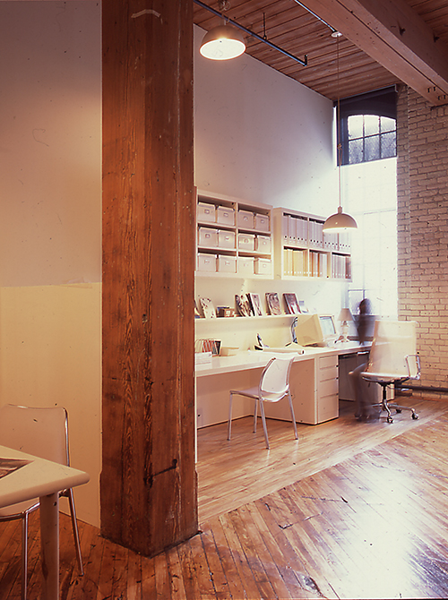
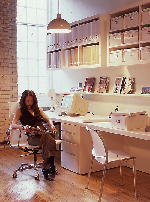
This commercial office/loft renovation for a west end Toronto graphic design firm was located in an historic carpet manufacturing warehouse. The client wanted a clean and contemporary space that showcased the turn-of-the- century architecture, yet reflected their youthful vibe, and one that appealed to their design savvy clientele. We used budget friendly prefab furniture from Ikea, then made custom, floating bookshelves and tabletops to match.
The result was an airy, light filled, clean space that served as a blank canvas for the client’s displays of projects and inspirations.
