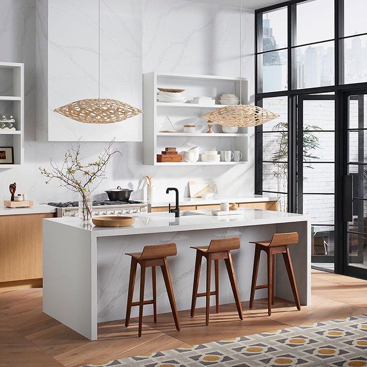
Recently I had the opportunity to design my dream kitchen – a collaboration with Cosentino Group, Kohler Kitchen Fixtures and Benjamin Moore Paint – all leaders in the world of Interior Design and Architecture. My design is inspired by the idea of an organic loft in an urban setting that is connected to views of the nearby city skyline through an inner courtyard garden. In this blog, I share the evolution of my design from the early sketches, to the final construction.
I designed this space for a creative couples’ urban loft featuring soothing, warm finishes in a clean architectural setting. To bring this project to life I created my own clients. They are a couple in their 30’s - he is a writer and she is a photographer/artist. They both work at home, have 2 kids and enjoy living in an urban setting. Their home was inherited from her grandmother - it was formerly a stable. Access to the outdoors was always something she remembers from her childhood visits where ongoing sculpture projects by her grandparents were created in the outside walled garden with a constant flow of artists and writers who came to the salons in the kitchen/family room. The new owner wanted to continue this tradition while also bringing the space into the present. This kitchen/outdoor space is the center of their home. In spring/summer/fall they eat outside, and in the colder months they enjoy making the winters more livable by creating a magical winter wonderful-land to look out through the two story windows. Outdoor lights, green ivy everywhere and bird feeders make this space an all-year-round focus.
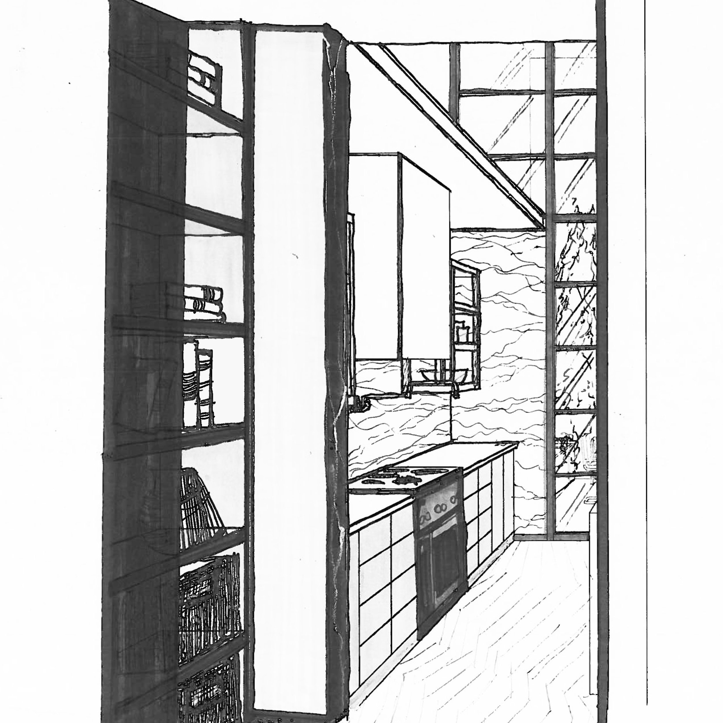
Here is one of my early sketches.
The Finished Room!
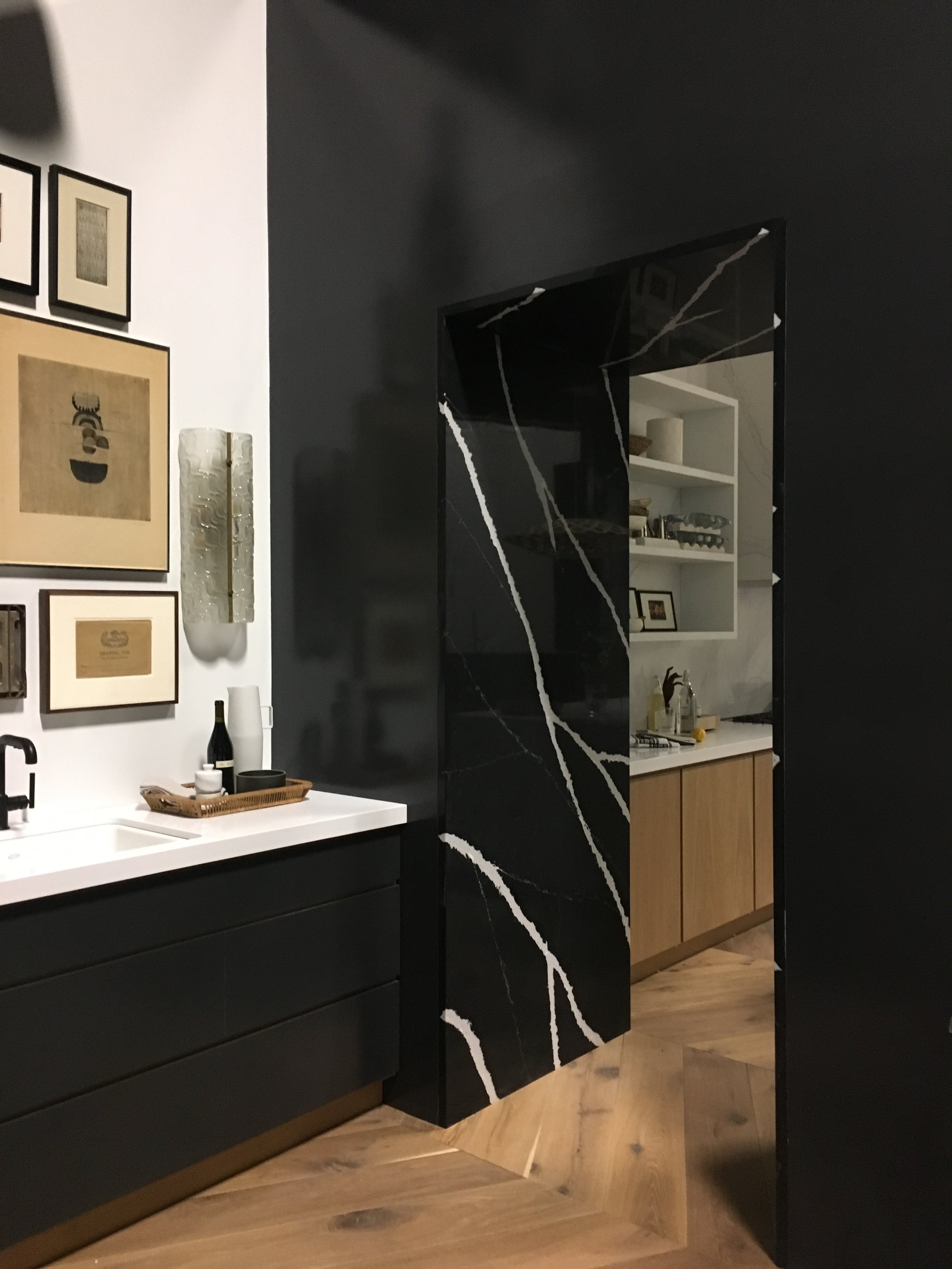
In the Bar/Library I like the unexpected art wall and library which speaks to the clients passion for art and books - always incorporated into my work is a reflection of the interests of my clients. I incorporated hand-made details to enliven the space and these 1930’s Italian handmade sconces are perfect for this clean space because of the texture and interest they bring. The installation of the art in the bar area is termed “Salon Style” and brings an organic quality to create tension and interest. Similarly, the accessories throughout are installed with this in mind. Too much symmetry can dull a space!
The Silestone Eternal-Marquina Stone by Cosentino in the archway between the kitchen and the bar area, creates a bold transitional space into the unexpected library beyond. See above the original sketch and the finished space.
Balance and symmetry are key components in this design. This is apparent in the above shot showing the view from the kitchen to the Bar/Library.
It was an absolute pleasure to collaborate with the Cosentino, Kohler and Benjamin Moore! Keep an eye on our progress, and the Silestone Trendspotters team by following @SilestoneByCosentino! Keep an eye on our website for future blogs that talk about the finishes.
@silestonebycosentino@kohlerco @cosentinousa@cosentinocanada @benjaminmoore#Silestone #SilestoneTrendspotters#SilestoneTrends #InfluencerSeries#architecturelovers #archilovers#renovations #inspired#architecture#warmtones #instadesign#homes #decor #interiors #interiordesign#luxurydesign #homedecor#interiorachitecture #wanderlust#vintagestyle #tile #shabbychic#instadecor #dreamhouse#homeimprovement #instahome #modern#contemporary


